After learning how to graph data with R (and finding out all of the different MySQL tricks that came along with it,) I decided to try gnuplot. gnuplot is a portable command-line driven graphing utility for linux, OS/2, MS Windows, OSX, VMS, and many other platforms. You can see a slew of different example graphs over at the Wikimedia page for gnuplot diagrams.
It’s much different than R. My previous use case for R was generating graphs, which is a small subset of the capabilities R provides. For example, R needs a datafile filled with data for analysis, where gnuplot only wants data that is pertinent to graphing. As a result, I needed to change my MySQL queries to be conscious of the fact that gnuplot only wants what it absolutely needs.
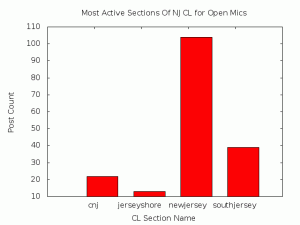
My first goal was to make a pie chart with gnuplot, but it’s not possible according to their FAQ. So I scratched that idea and made a histogram/barchart instead using the data pulled from a set of Perl scripts I wrote a while ago:
The code for this is pretty painless and can be done through either gnuplot’s interactive shell, or through scripting. If you’re running it interactively and want to save the output, be sure to run “save ‘filename.plot'” before exiting:
#!/usr/bin/gnuplot -persist set terminal png nocrop font small size 640,480 set output 'barchart-openmic.png' set style data histograms set title "Most Active Sections Of NJ CL for Open Mics" set xlabel "CL Section Name" set ylabel "Post Count" plot "/tmp/bargraph.csv" using 2:xticlabels(1) notitle |
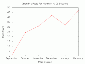
It’s also interesting to note that the “plot” function takes a lot of parameters — the above code could be much shorter. I wanted to see the increase in activity on CraigsList over time, so I made a second graph. A few slight changes to the code pumps out a basic line graph. It actually took me longer to get the SQL query right than to put the code down (both quick though!). The primary change was the “set style” line, which became “set style data linespoints”. The result was exactly what I was hoping for:
That’s it! gnuplot is great for simple graphmaking. I’ve got a cronjob set up that points to a simple bash script that runs the SQL query, then gnuplot, and then the “rm” on the file. It’s automatic graphing:
pull data -> dump data -> graph data
I’m looking forward to creating some of the more complex charts that I saw on the Wikimedia page and eventually using them to help revitalize JerseyMic. More about the JerseyMic project later!
(Interested in getting started? Math-blog.com has a pretty great post on the topic!)

